Friday, July 30, 2010

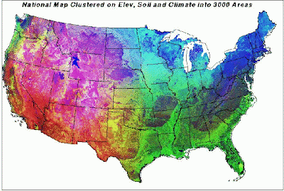
Multivariate Choropleth Map


This is a cholopleth map that uses multiple variables in its map creations process. In the example above each cell which represents one square mile has nine. These were things like elevation, soil nitrogen, organic matter, etc. A supercomputer was needed to combine all this data.

Classed Choropleth Maps


Like all choropleth map this is another type of thematic map, but it uses color and shading to represent something within a map. This map is considered classed because it contains a legend the explains how to read the colors and data the map displays.

Unclassed Choropleth Maps

Source: http://datavis.ca/milestones/index.php?group=1800%2b

This choropleth map is an example of an unclassed map. It was created in 1819 by Dupin and in black and white displayed the distribution and intensity of illiteracy in France. It is one of the first examples of a choropleth map and at the leading edge of statistical mapping at the time. Unclassed maps are not very useful as they don't contain the legend that helps intrepid the data.

Parallel Coordinate Plot

Source: http://www-vis.lbl.gov/Events/SC07/Drosophila/

The parallel coordinate plot is a type of geovisualization. This example 3-D parallel coordinate view of all cells and nine selected genes. In this type of plot each variable is graphed on a vertical axis.

Stem and Leaf Plot

Source: http://www.unl.edu/tcweb/fowler/DrFowlersMathQuiz/stemAndLeafPlot

This is example of a stem and leaf plot. The stem is on the left side of line and the leaves on the other. It is easy to spot the in this case 7. You can tell because it has the most leaves. This is quick alternative to bar and line graphs and is another example of a geovisualization type.

Box Plot


This is a box plot, or box and whisker diagram. It shows the central location or median, the average and dispersion. This is helpful in comparing one or more data set. In the case of the example the data sets are different species of bats,

Triangular Plot

This type of geovisualization is used to compare three variable as positions on an equilateral triangle. In this example the variables are immigrant, other service and gentrification. The intersection of lines on these graphs indicates the interaction of the variables.