Friday, July 30, 2010

Multivariate Choropleth Map


This is a cholopleth map that uses multiple variables in its map creations process. In the example above each cell which represents one square mile has nine. These were things like elevation, soil nitrogen, organic matter, etc. A supercomputer was needed to combine all this data.

Classed Choropleth Maps


Like all choropleth map this is another type of thematic map, but it uses color and shading to represent something within a map. This map is considered classed because it contains a legend the explains how to read the colors and data the map displays.

Unclassed Choropleth Maps

Source: http://datavis.ca/milestones/index.php?group=1800%2b

This choropleth map is an example of an unclassed map. It was created in 1819 by Dupin and in black and white displayed the distribution and intensity of illiteracy in France. It is one of the first examples of a choropleth map and at the leading edge of statistical mapping at the time. Unclassed maps are not very useful as they don't contain the legend that helps intrepid the data.

Parallel Coordinate Plot

Source: http://www-vis.lbl.gov/Events/SC07/Drosophila/

The parallel coordinate plot is a type of geovisualization. This example 3-D parallel coordinate view of all cells and nine selected genes. In this type of plot each variable is graphed on a vertical axis.

Stem and Leaf Plot

Source: http://www.unl.edu/tcweb/fowler/DrFowlersMathQuiz/stemAndLeafPlot

This is example of a stem and leaf plot. The stem is on the left side of line and the leaves on the other. It is easy to spot the in this case 7. You can tell because it has the most leaves. This is quick alternative to bar and line graphs and is another example of a geovisualization type.

Box Plot


This is a box plot, or box and whisker diagram. It shows the central location or median, the average and dispersion. This is helpful in comparing one or more data set. In the case of the example the data sets are different species of bats,

Triangular Plot

This type of geovisualization is used to compare three variable as positions on an equilateral triangle. In this example the variables are immigrant, other service and gentrification. The intersection of lines on these graphs indicates the interaction of the variables.

Cartographic Animations

Source: http://map.sdsu.edu/geog104/lecture/unit-10.htm

If you go to the source site listed above you will see on the map an animation that represents the San Diego wildfire. The animation contains six slides which span day zero, October 25th 2003 through day six October 31st 2006. Red and yellow dots appear on the map and move across the landscape, being replaced by brown for the areas that have burned already. Animation allows you to see interactions and movements on normally static maps.

Population Pyramids


Pyramids are a type of population profile. This special geovisualization which displays age and sex distributions for a given region and gets its name from the shape that layout produced. This pyramid was created by the NSW government and is a comparison of 2006 population to an estimated population in 2026. It would appear that they foresee the overall population aging.

Population Profile


A population profile is a graphical presentation of given population and a type of geovisualization. This can be represented by graphs, population pyramids or other methods. This bar graph from the U.S. census department show the percentage of the labor force comprised of males, females and total population, as percentage of their given population. Over the sample years female employment is increasing, while males has declined.

Histogram


A histogram displays tabulated frequencies. Showing the number of samples that fall within a given category. A histogram is also a type of geovisualization, and differs from a bar chart in some significant ways. This is a histogram of final examinations.

Wind Rose


A wind rose is a type of geovisualization, that represents wind direction on a round plot over a given time period. The is based on frequencies, direction and wind speed. This wind rose information is based on an observational period from 1971-2000 and is based on data from the locations in Ontario, Canada. From this data you can see that wind is strongest out of the NW and weakest out of the NE.

Climographs


Climograph is a type of geovisualization, in which there is a graphic representation of the relationship between temperature and precipitation. Typically this is plotted in monthly intervals and covers an entire year. This climograph is for Iquitos, Peru. This location has a near uniform temperature, however rainfall is greatest during the months of December - February.

Correlation Matrix


Correlation is a matrix that shows how similar different variables are, based on a given scale. This too is a type of geovisualization. These types of representation seems to very popular within the biomedical field, especially when dealing with genes. This is a matrix of 130 surface-enhanced laser desorption/ionization time-of -flight mass spectrometry peaks. Red is a positive correlation and green negative.

Star Plot


The star plot is a type of geovisualization, that allows you to compare multiple variables for each observation. This plot is from U.S. Department of the Interior and shows the water quality of samples. The plots are from multiple locations, dates and samples. The variables of each include items like pH and other chemical content. This allows you to visually see the difference in the water.

Scatter Plot


The scatter plot is a type of geovisualization, where individual data points are plotted on a graph. A trend line is then adding showing the mean and directional how the data lays out. This plot is from U.S. Department of the Interior and shows reservoir water surface elevation in feet verse the hydraulic piezometer water surface elevation also in feet. They both increase up the trend line, thus indicating a positive relationship. The dots are also close to the line showing a strong relationship. Also, instead of just using dots in the scatter, they instead used the value of the data points.

Index Value Plot


The index value plot is a type of geovisualization, in which an index value is plotted instead of an absolute number. This index value plot is a sample of the condition of woodland sites against time, covering the years 1988-1993. Increases in the index value are associated with a decline in the condition of the site. The ones declining appear to be those in poor condition. The rest are flat.

Accumulative Line Graph or Lorenz Curve


The accumulative line graph or Lorenz curve is a type of geovisualization. The solid center line represents an equally distribution. The others the actual distribution. This Lorenz curve shows the per capita house expenditures of the Maldives for the time period 1997-98 and 2002-03.

Bilateral Graph


Source: http://www.bls.gov/opub/ils/summary_10_06/illness_related_work_absences.htm


A bilateral graph is a type of geovisualization. The graph has two related variables, which the user or cartographer can then compare for correlation or explanation of a trend and/or phenomenon. The bilateral graph presented above contains data on people who worked less than 40 hours in week and the reason between April 2005 and March 2010. One see peaks that relate to flu season, which peaks December through March. However, other absences also peak during this time as well.
Pie Chart


Source: http://bigthink.com/ideas/21259

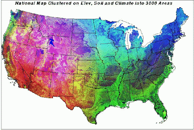
A pie chart is a type of geovisualization. This type of chart moved people away from recording data in like accountants in columns and rows and may have been the beginning of geovisualization or cartographic visualization. This is a hypothetical division of Antarctica based on an idea called the frontage principle. So, countries with an un-restricted southern passage across open seas to the continent can place a claim. The amount of frontage equals the claim size. Based on this Antarctica can be divided between 47 countries.

Social Network Map


A social network map is not a map of the real world, as it shows only relative space. They are considered maps because they show how information moves through a network. In these maps you can see how areas or people interact and when they come in contact with one another. These contacts maybe impactful. This is a map of Lucent's intranet network. The network shown has 3,000 announced networks, so it appears smaller than the rest of internet. In this case the social aspect is machine to machine, and not the connections between people.

LIDAR


LIDAR or light detection and ranging uses a laser to measure an object. This is another remote sensing technique, that can be used to make detailed surface images. This is a three-dimensional image of the canopy structure from a Savanna field study site created by using pulsed LIDAR. Not only does LIDAR capture elevation changes but also structures, in this case trees.

Doppler Radar

Source: http://radar.weather.gov/Conus/southeast.php

Doppler radar uses a transmitter to emit microwave radiation, and a directional antenna to receive and measure the arrival of the emitted pulses as they reflect back from objects. This type of radar is use to make atmospheric profiles of clouds, and can measure motion, make-up and rainfall. This image is a National Weather Service Mosaic radar of the Southeaster Sector.

Black and White Aerial Photo


Again a type of remote sensing, which can be used as part of DOQQ or other maps. The wavelengths displayed though are roughly the same as the human eye. This is a black and white example from a DOQQ of Oklahoma.

Infrared Aerial Photo

Source: http://www.nps.gov/history/history/online_books/indu/1085/sec3.htm

A type of remote sensing used as part of DOQQ from the USGS. The infrared light spectrum allows for the identification of elements not visible using the standard light spectrum. An examples being different types of vegetation, which in these wavelengths appear differently. The photo is of the Indiana Dunes National Lakeshore. Vegetation is displayed as red.

Thursday, July 29, 2010

Statistical Maps


This is an umbrella category that encompasses any map that displays statistical information. Examples would included flow maps, dot maps, choropleth and other thematic maps. The example selected is a proportional circle map showing temperature anomalies in January 2007 verse a statistical base period of 1961-1990.

Cartograms

Source: http://www.inhabitat.com/2008/09/01/worldmapper-cartogramps-revisualize-the-world/

This is a type of thematic map, but instead of superimposing the information over the standard geographical map, the information represented distorts the land areas. The map shows CO2 levels produced by country. The U.S. and China are huge, while Africa at least in the center disappears.

Proportional Circle Map

Source: http://scienceblogs.com/goodmath/2009/03/more_stupid_graphs.php

This is a type of thematic map, but it uses circles of varying size and shading to represent something at a physical location or general area. The map included shows unemployment in the lower 48 states. Those states with higher unemployment have larger circles, then those with less.

Propaganda Map

Source: http://www.silviavv.com/images_neu/florida%20map.jpg

Propaganda as defined is the spreading of ideas, information, or rumor for the purpose of further a cause or damage an opposing cause. These types of ideas fall into the realm of critical cartography, constructing space and creating ideas that influence the way we see the world. Propaganda is therefore a matter of opinion, but using the definition broadly any map promoting Florida tourism can be seen as propaganda. Although, I'm sure no one that works in the tourism industry sees it quite that way. The Florida map I selected is one that you could classify as propaganda. It has dolphins, palms trees and all the great thing about the state and none of the bad. So this is definitely pushing an idea of Florida being a great place to visit, with tons of activities and locations to enjoy.

Mental Map


A mental map deals with how each person views the world around themselves. This could be a drawing of the city a person has in their mind or representation of a concept or idea. These maps have more to do with perceptions and not the physical realities you might find on the ground. This is important to understand because this can help the cartographer understand what a person perceives as important in a map they might designed to get that person from point A to B. I selected a before and after mental map that I thought illustrated the concept very well. A student drew a map or Africa before study and then after. You can see a clear difference between the two illustrations. A teacher seeing this can easily see that South Africa and the Sahara desert are understood, while other areas need work.

Flow Maps


This type of map range from flow charts, which you'd see in a traditional business environment, to hybrids that adds flow charts elements and ideas of movement to more traditional maps. These might be used to show trade routes or flight plans. Volume can be indicated by the size of lines, for example. The map example shown highlights the migration flows of people in the greater Mekong region. Note, lines in this map show direction but not volume. Volume is detailed in the tables.

Digital Ortho Quarter Quads Map


A digital ortho quarter quads map or DOQQ is produced through aerial photography. Most aerial photography produces distortion, but this method uses a uniform scale that allows many photos to be put together to form a true map. This method is not without issues however. The map I selected is part of a presentation from the USDA on issues one might have with DOQQ. The map below from NAIP04 DOQQ is 3109163_nw and lacks contrast and color due to haze.

Digital Elevation Model Map


A digital elevation model or DEM is a digital topographical map, or a map that displays surface relief. They can be created using a number of different methods from traditional surveying to remote sensing equipment, like satellites. The map below is the Lake Tahoe basin. It was created using a bathymetric elevation model. This map is black and white verse color. Whites and lighter colors represent higher elevations.
Choropleth Map


Source: http://www.agcensus.usda.gov/Publications/2002/Ag_Atlas_Maps/Crops_and_Plants/Field_Crops_Harvested/Wheat/All%20Wheat%20for%20Grain,%20Harvested%20Acres-chor.gif

This is another type of thematic map, but it uses color and shading to represent something at a physical location. The map above is for all wheat for grain harvested by acre in 2002. The color varies from pale yellow-green to dark green and sections are divided by county. The darker color showing higher density. Looking at the map it becomes clear that the mid-west and especially the northern boarders of the country are the wheat producing mecca of the United States.

Dot Distribution Map


A dot distribution map is a type of thematic map in which dots are used to represent something at a physical location. Dots can be used in a number of ways and sizes. The map I've selected is from the National Institutes of Health Office of Science Education. It shows, using dots, where in the lower 48 states over 350,00 copies of the NIH curriculum supplements have been sent to requesting teachers. The dots in the map are all the same size, and locations close together begin to look like blue blobs. This map on the web site toggles to a nighttime image of the U.S. This way you can compare requests to population density as indicated by nighttime light imagery.


Hypsometric Map


This is a map surface map that depicts relief. Three-dimensional information is communicated by this type of map in a number of forms color and shaping, raised relief or contour lines. In addition to relief or topography, other variables that describe a phenomena or process can be superimposed onto the maps surface. To show this type of variable superimposed onto a map I selected a map showing the depth to the water table in the state of Wisconsin. The map uses differing shades of blue to show depth, with lighter being closer to the surface then the darker blues.

Public Land Survey System Map


This is a type of cadastral map. The Public Land Survey system or PLSS is a method used in the United States to survey and title and deed certain types of land. The system begins with the initial point. This is the intersection of the base line(east-west) and the principle meridian(north-south). From that the basic unit of measure is the townships, these are east-west lines moving out from the base line at six mile intervals. The same is done from the principle meridian(north-south) at six mile intervals and these are called ranges. The squares formed by their intersections are known as a congressional township. These townships each have a grid number based on the initial point. Each congressional township can also subdivided into 36 one-mile square parcels called sections. I've picked a PLSS map of Flathead county Montana. The map shows the county divided into congressional townships. This map is also a GIS and you can select a township and click it to pull that section of map up divided into sections.

Cadastral Map


Source: http://techcenter.jefferson.kctcs.edu/GIS/modules/Advgis/PublishingImages/KY%20State%20Plane.png
A cadastral map is a map that is based on the official statement of the quantity of the real property for a given area. These would be official maps and might be used for things like taxes and property ownership. A example of a cadastral system is that of the State Plane Coordinate system, which is used for location information or for land partitioning. Other systems that might be used to create a map of this type would be a unsystematic land partitioning system using metes (units or distance) and bounds (names of markers) as a way to divided land according to ownership or the PLSS which is a systematic method. I've used for my example a map of Kentucky showing its State Plane Coordinate system. The state is divided into two zones north and south.

Thematic Map


This is a map that shows a particular theme connected to a geographic area. These can be social, political, economic or really any theme that can be related within a map of a specific theme. Historically one of the most important examples of a thematic map was the John Snow's Cholera map in published in 1854. This was one of the first examples that lead to the modern geographic information system or GIS, which today can be exploited by many of us to create customized maps of our own theme maps using software available over the Internet. The example of a thematic map I've selected is one showing the number of new businesses in the lower 48 states by county. The colors range from white or 0, to dark red or 7000+. This way one can quickly evaluate the areas of the U.S. that are producing new businesses and possibly jobs.


Isoline Map


Isoline maps represent the overall category of maps which use continuous lines to join areas of the same or similar values. These types of maps can include isobar, isotherms, contour lines and others. My map is from the U.K.'s Met Office and shows the 2009 summer mean temperature 1971-2000 anomaly. Areas are defined by color, with darker red having a higher anomaly or variance from the mean as measured in degrees Celsius.

Isobars


Isobars maps are a type of Isoline line map in which the continuous lines joiningareas of the same or similar values, represent atmospheric pressure. This map was produced for Friday July 30th and shows isobars only for the United States.

Isotachs


Isotachs maps are a type of Isoline line map in which the continuous lines joining areas of the same or similar values, represent wind speed. This is a map of the Pacific coast of North America displaying 300 mb wind isotachs.

Isohyets

Source: http://www.srh.noaa.gov/ssd/techmemo/sr202.htm

Isohyets maps are a type of Isoline line map in which the continuous lines joining areas of the same or similar values, represent rainfall amounts over a given time. The map I selected is from a report on precipitation climatology produced for the hydrologic service area of NWSO Nashville. It shows the average annual precipitation distribution in inches for middle Tennessee.

Isopach

Source: http://www.glossary.oilfield.slb.com/DisplayImage.cfm?ID=114

Isopach maps are a type of Isoline line map in which the continuous lines joining areas of the same or similar values, represent thickness or stratum, such as ground water or other geological elements. This map is an isopach of an oil reservoir with the contour lines in red.

Isotherm

Source: http://www.cpc.ncep.noaa.gov/products/analysis_monitoring/regional_monitoring/us_weekly_avgt.shtml

Isotherm maps are a type of Isoline line map in which the continuous lines joining areas of the same or similar values, represent temperatures. This maps shows the average temperature in Fahrenheit for the week of July 18 -24, 2010.

Isopleths

Source: http://vigor.wustl.edu/otag/otagactivities/mopresapr97/mopresapr97.htm

Isopleths is the name sometimes used for encompassing all the different maps dealing with meteorology, such as isobar, isotherm and others. It can also be use more broadly to describe simply an isoline map or one having contour lines. This maps shows average daily maximum ozone concentration for the eastern U.S. The areas of concentration are broken down in parts per billion (ppb), with the highest amounts in red.


Digital Raster Graphic

Source: http://csat.er.usgs.gov/statewide/small/drg250.png

A digital raster graphic or DRG is a scanned image of a paper USGS topographical map. The map above is a digital raster graphic of the state of Georgia at 1:250,000 scale.


Digital Line Graphs

Source: http://edc2.usgs.gov/geodata/images/hydro.gif

Digital Line Graph or DLG is another product from the USGS. They again use their vast collection of maps and create a digital versions, in this case displaying simple line graphics. These lines can represent features such as roads, rivers or boundaries. This map shows the states of Illinois and Missouri and the hydrography of each.

Topographic Map

Source: http://www.americansouthwest.net/utah/zion/zion-canyon-topo-map.html

A topographic map is one that shows relief or depth. This can be accomplished in a number of different ways, this includes but is not limited to, contour lines, shaded relief and raised-relief maps. Raised-relief maps are actually produced in three-dimensions like a model. The example of a topographical map I've included is a map of Zion Canyon in Zion National park. It is a contour line map that a hiker visiting the park might employ, the lines representing changes in elevation.

Planimetric Map


A planimetric map is one that only represents horizontal positions, so it is flat or two-dimensional. This type of map would contain no topographic information, or references to heights or other vertical positions. It is sometimes referred to as a line map. The example of this map shows the counties of Great Britain. Each county is shown as a color with simple line boundaries separated by lines. It contains no topographical information and is completely flat.